
Mastering the Art of Colour Psychology in Graphic Design
When it comes to graphic design, colour is much more than just a visual element. It is also a powerful tool that can evoke emotions, influence decisions and convey messages to your audience.
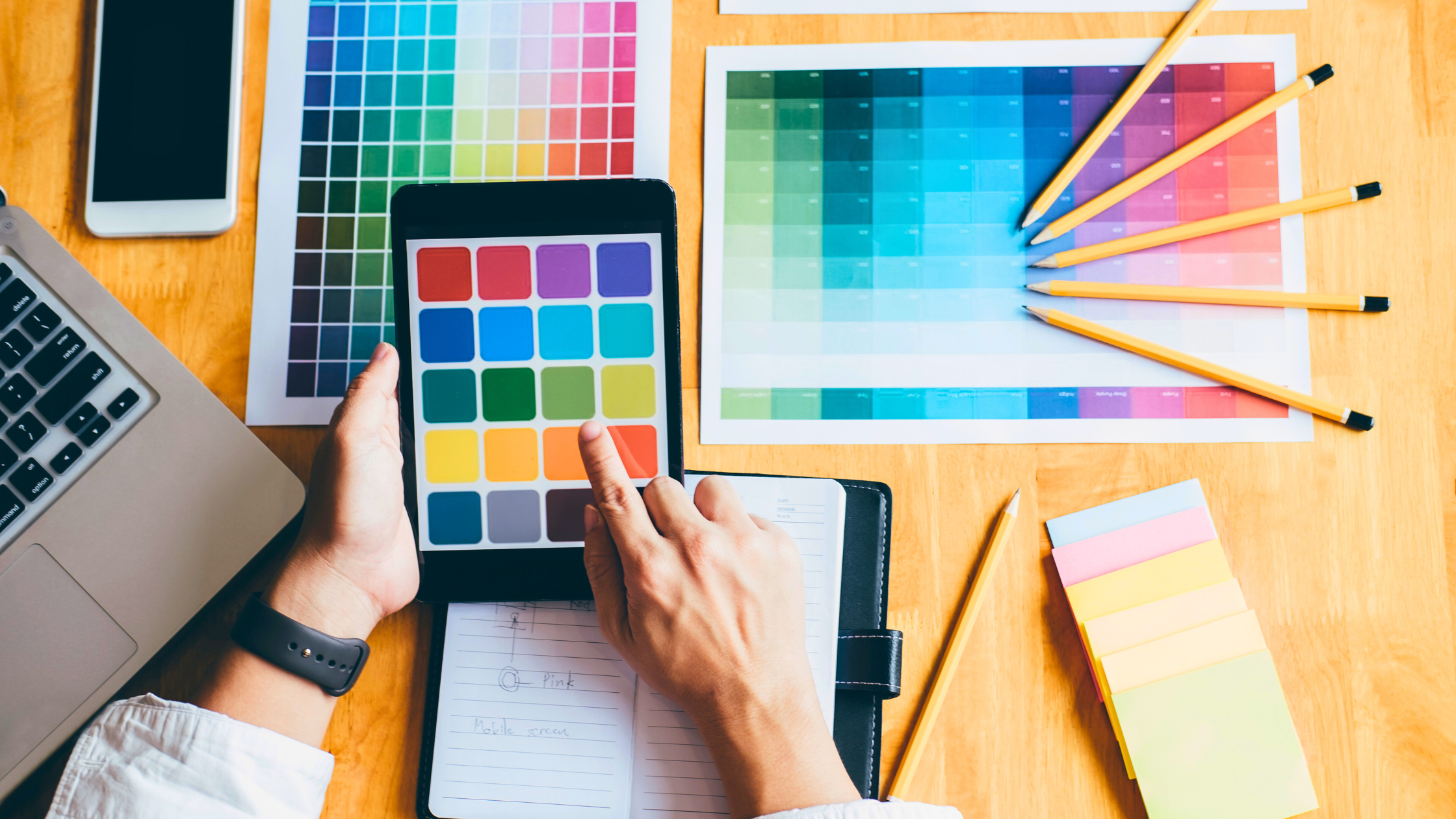
With that in mind, if you are a graphic designer, it’s essential to understand the psychology behind colour and know how to harness it correctly to transform your design into something truly impactful. To do that, you first need to learn the sociocultural meanings behind the following common (and well-used!) colours and how they can affect human behaviour and perception, such as evoking different emotions.
Red: Often associated with passion, excitement, and urgency. It can stimulate the senses and is commonly used in clearance sales.
Blue: Conveys trust, calmness, and professionalism. Financial institutions and tech companies frequently use it to instil confidence.
Yellow: Evokes feelings of happiness, energy, and warmth. Yellow is an excellent colour for grabbing attention, but it can be overwhelming if overused.
Green: Associated with nature, growth, and health. It's commonly used by brands related to wellness, environmental products, and finance.
Purple: Symbolises luxury, creativity, and wisdom. It's often used in beauty products and brands targeting a more sophisticated audience.
Black: Conveys elegance and power. It’s widely used in luxury brands and high-end products.
White: Represents purity, simplicity, and cleanliness. It’s a popular choice in minimalist designs and for creating a sense of space and openness.
Now that you know the meanings behind these colours, here are 6 strategies to consider to harness colour psychology in your design project effectively:
Understand Your Audience
Your audience is your bread and butter, so delivering designs they will relate to and enjoy is crucial. With this in mind, remember that different demographics may perceive colours differently. For example, younger audiences might respond more positively to bold, vibrant colours such as yellow or bright green, while older audiences may prefer more subdued tones like a softer blue.
Gender can also play a role, as studies suggest that men and women have different colour preferences. Keep that in mind when crafting your design, and it may be worth putting aside some time to research your key audience and the colours you’re planning to use first.
Establish Brand Identity
Colours are one of the most important parts of your brand identity. Think of iconic brands like Coca-Cola with its signature red design or Facebook with its familiar blue. Their consistent use of colour initially helped build brand recognition and loyalty and has played a part in ensuring their longevity. Do you have a colour in mind that might achieve a similar result? Consider what colours reflect your brand’s value and personality and how they might influence how your customers view you.
You might also want to consider a colour that will help you stand out from your competitors. This is a great way to establish your brand identity and ensure that your brand makes an impact.
Create Emotional Connections
The right colours can help you create an emotional connection with your audience. Suppose you’re designing for a charity, for instance. In that case, colours like blue and green can evoke feelings of trust and compassion – and make your audience feel more connected to the brand and, therefore, more inclined to associate with it. Similarly, for a children’s toy brand, bright and cheerful colours like yellow and orange can convey the fun and excitement kids are looking for in their entertainment.
Highlight Key Elements
Colour can be strategically used to highlight important elements in your design. For example, if you have a call-to-action button that you want to stand out, utilising a contrasting colour (like red on green) can draw attention and encourage clicks. However, remember to be mindful of colour contrast to ensure readability and accessibility for all users. You also want to ensure it looks good, as some colours clash.
Cultural Considerations
Did you know that colours can have different meanings in different cultures? If you are designing for a global audience, this is one point you will want to keep in mind. For example, red may evoke emotions such as passion or danger, but in China, it signifies good fortune, among other things. If you are designing for a multicultural audience, it is always a good idea to research cultural colour associations to avoid misunderstandings.
Test and Iterate
Like many things, colour perception can be subjective. It’s essential, then, to test your designs with real users before committing to the end result. Gather feedback and ensure that you are open to making adjustments based on their responses. After all, if they don’t engage with your colour choices or view them as not aligning with your overall brand identity, then there is a good chance that others in your target audience will feel similarly. This will obviously affect your overall brand and its marketing effectiveness. A/B testing different colour schemes may also help determine which colours resonate best with your audience.
At the end of the day, harnessing the power of colour psychology in graphic design is an art and a science. By understanding the emotional and psychological impacts of colours, you can create designs that look good, communicate effectively, and resonate deeply with your audience. Whether building a brand, creating a website, or designing a marketing captain, thoughtful colour choices can significantly enhance your overall success.
If you need help with your branding, we are always here to offer some guidance. Send us a message, and we’ll be happy to help!